What would happen if you handed your entire website to Google’s AI and said “make it better”?
I tried it. Took about five minutes. And the results were… honestly kind of strange. Beautiful in ways I didn’t expect. Wrong in ways that made me laugh. And surprisingly useful as a creative exercise — even though I’d never ship a single pixel of what it produced.
Here’s exactly what happened when I fed findskill.ai into Google Stitch and asked it to reimagine our course experience from scratch.
What Is Google Stitch?
Google Stitch is an AI design tool that came out of Google Labs, announced at Google I/O 2025. It uses Gemini 2.5 Pro under the hood and does something that sounds too simple to be real: you upload a screenshot of your site (or just describe what you want), and it generates complete UI designs with production-ready HTML and CSS.
It’s free. No waitlist anymore. You just go to the Google Labs site and start.
The feature list is genuinely impressive. There’s Image-to-UI, where you upload a screenshot and get back a redesigned version. Vibe Design, where you describe the feeling you want instead of specifying exact layouts. Voice Canvas, so you can literally talk to it. And when you’re done, you can export to Figma or grab the generated code directly.
The obvious competitors are Vercel’s v0, Lovable, and Bolt. But Stitch has one advantage none of them do — it’s backed by Google’s design language and Gemini’s multimodal understanding. It doesn’t just generate interfaces. It reads your existing ones and tries to understand what you’re going for.
At least, that’s the pitch. I wanted to see what it actually does.
What I Fed It
FindSkill.ai is an AI skills directory with over 1,000 downloadable skills and 200+ courses across 10 languages. I’ll be honest — the design is functional but not going to win any awards. It works. It’s fast. But “editorial magazine aesthetic” isn’t exactly how I’d describe it.
So I grabbed screenshots of our course pages and uploaded them into Stitch with a simple prompt: reimagine the course learning experience for this platform. I didn’t give it brand guidelines. Didn’t specify colors or typography. Just let it cook.
It came back with four screens. A course library, a course detail page, an active lesson player, and a personal learning dashboard.
Here’s what it produced.
Screen 1: The Course Library
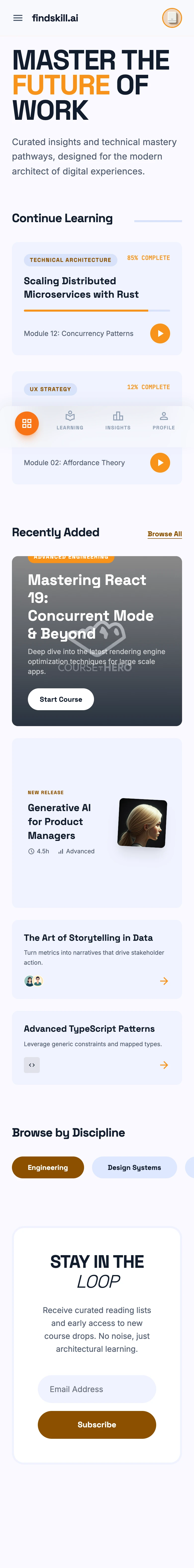
The first thing I noticed was the typography. Stitch picked something that looks like Space Grotesk — big, confident, editorial. The hero section reads “MASTER THE FUTURE OF WORK” in all caps with a warm orange accent that carries through the entire design. It’s got a vibe that’s closer to a design magazine than an ed-tech platform.
What’s clever is the “No-Line Rule.” Notice how there are almost no visible borders anywhere. The card hierarchy is created entirely through tonal shifts — slightly different background shades — instead of 1px lines. That’s a real design principle that most AI tools don’t pick up on. Stitch did it instinctively.
There’s a “Continue Learning” section with progress bars, browse-by-discipline pills, and an email subscribe section at the bottom. The asymmetric card layout breaks up the grid in a way that actually feels considered, not random.
What surprised me: The overall composition is more cohesive than what I’d get from most human designers on a first pass. The spacing is consistent. The color palette is restrained. It looks like it was designed by someone who read the entire Material Design spec and then deliberately broke a few rules.
What it got wrong: The “Continue Learning” section implies returning users, but Stitch has no idea what our actual course structure looks like. It’s designing from vibes, not from data.
Screen 2: The Course Detail Page
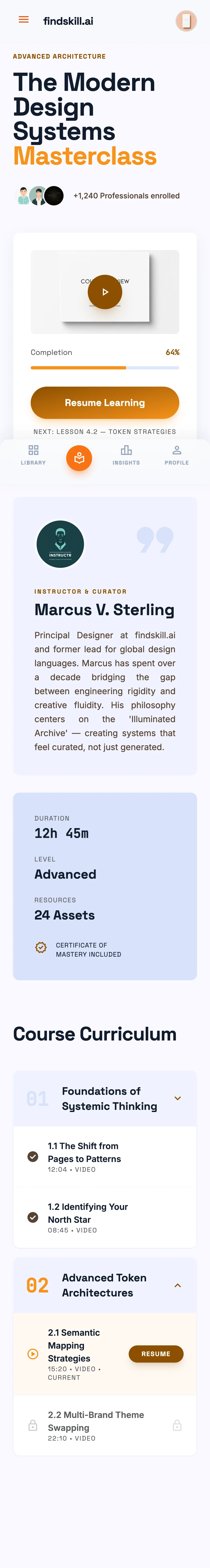
This is where things got interesting. And a little weird.
Stitch generated a course called “The Modern Design Systems Masterclass” taught by “Marcus V. Sterling” — a person who does not exist. There’s a profile photo placeholder, a bio section, and even a video preview with a play button.
The curriculum section is clean. Modules broken into clear sections with lesson counts and duration. There’s a progress bar showing 64% completion, stats for duration, difficulty level, and downloadable resources. The hierarchy from course title down to individual lessons reads naturally.
What’s genuinely good: The information architecture here is solid. Stitch understood that a course detail page needs a clear value proposition at the top, social proof (the instructor), a visual preview, and a scannable curriculum. That’s not trivial — it’s the kind of thing that takes a product designer a few iterations to nail.
What it completely fabricated: We don’t have video content. We don’t have instructor profiles. Our courses are text-based with quizzes and projects. Stitch invented an entire content format that doesn’t exist on our platform. It designed the ideal course page for a hypothetical version of our product — not the real one.
And honestly? That made me think. Because the hypothetical version looks better than what we have.
Screen 3: The Active Lesson Player
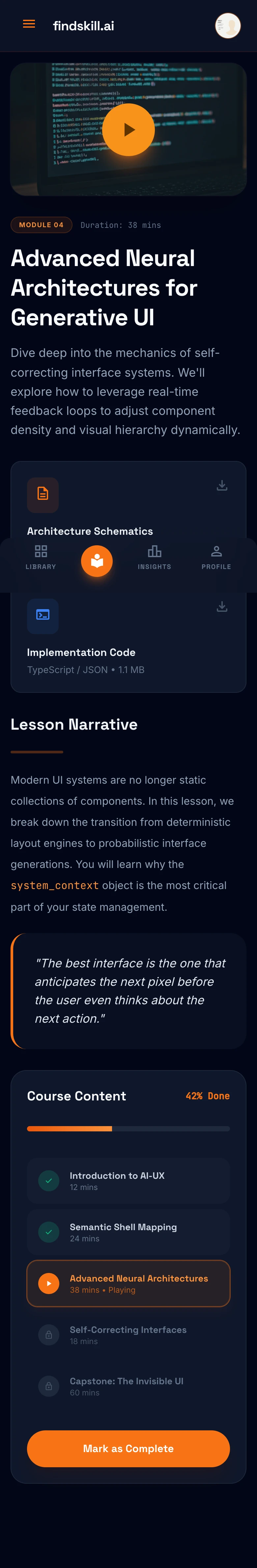
This one I genuinely liked.
Stitch went dark mode for the reading experience. The lesson text is laid out like a long-form article with generous line height and comfortable margins. There’s a styled blockquote that looks like it belongs in a design book. On the right, a course content sidebar shows progress at 43% with checkmarks on completed lessons.
But the real detail is the downloadable resources section. Stitch added PDF and TypeScript file downloads right within the lesson view. It’s a small thing, but it shows the AI understood that learners need supplementary materials alongside the main content.
What works: The dark mode reading experience is genuinely pleasant. If I were building a reading-heavy learning platform from scratch, this is close to what I’d aim for. The typography choices, the spacing, the way the blockquote breaks up the text — it all serves readability.
What’s aspirational but unrealistic: We don’t have downloadable TypeScript files. Our lessons are self-contained. And the sidebar navigation assumes a complexity of curriculum structure that we deliberately kept simple. Sometimes simpler is better, and Stitch doesn’t know our design philosophy.
Screen 4: My Learning Dashboard
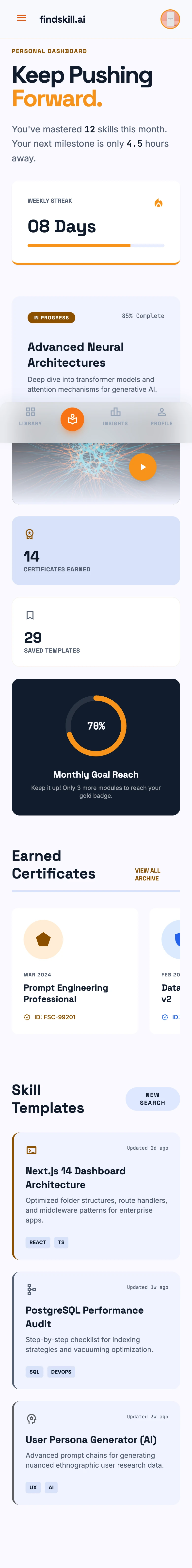
“Keep Pushing Forward.” That’s the headline Stitch chose for the personal dashboard. It’s corny and I kind of love it.
This screen goes full Duolingo. There’s an 8-day streak counter, a monthly completion goal at 76%, 14 earned certificates, 29 saved skill templates, and a section showing your earned certificates with completion dates. The gamification is everywhere — and it’s not subtle.
What’s smart: Stitch figured out that a learning platform needs motivation mechanics. The streak counter, the progress ring, the certificate collection — these are proven engagement patterns. We actually do have certificates on our courses, but we don’t have streaks or monthly goals. Seeing them laid out like this made me think about whether we should.
What’s fantasy: 14 earned certificates and a 76% monthly goal imply a much heavier user than we currently see. Most people complete one or two courses. Designing for a power user is great for inspiration, but it can mislead you about what your actual product needs.
What Stitch Gets Right
Stepping back from the individual screens, there’s something genuinely impressive about what Stitch produced as a system.
It thinks in design tokens. The spacing, color palette, and typography are consistent across all four screens. That warm orange shows up as accents, progress indicators, and interactive elements everywhere. The background tonal shifts follow the same logic. It’s not four random screens — it’s a design system.
It understands user journeys. The screens flow logically: discover courses, pick one, learn, track progress. Stitch didn’t just make pretty pages — it thought about how someone would actually move through the product. That’s a level of reasoning I didn’t expect.
The “editorial archive” aesthetic works. I wouldn’t have picked this direction myself, but the combination of bold typography, minimal borders, and warm-toned cards creates something that feels premium without being pretentious. It’s closer to Notion than to Udemy, and for our audience of AI-curious professionals, that might actually be the right call.
What Stitch Gets Wrong
It invents features. Instructor profiles, video content, downloadable TypeScript files — none of these exist on our platform. Stitch designed for a version of the product that lives in its imagination, not reality. If you handed these mockups to a developer without context, they’d spend weeks building features nobody asked for.
It optimizes for beauty over function. The designs look fantastic as static images. But where’s the search? Where are the filter controls? How do I find a course by difficulty level? Our current design isn’t as pretty, but it surfaces the right information. Stitch prioritized aesthetics and skipped the work.
No accessibility in sight. I don’t see focus indicators, ARIA considerations, or color contrast that meets WCAG standards. The dark mode lesson player in particular — that light gray text on dark background would need testing. AI design tools tend to treat accessibility as an afterthought, and Stitch is no exception.
The data is fake. “64% complete.” “8-day streak.” “14 certificates.” These numbers make the designs look alive, but they also set unrealistic expectations. Real dashboards often look emptier and sadder. Designing for the ideal state without considering empty states is a classic mistake — and AI makes it every time.
Will I Actually Use Any of This?
Honest answer: no, I won’t ship any of these screens. But some of the ideas are going into my notes.
The tonal layering instead of borders is something I want to try. Our current design uses a lot of 1px lines to separate sections, and the Stitch approach of using subtle background shifts is cleaner.
The dark mode reading experience for lessons is genuinely good. We don’t have a dark mode for course content right now, and seeing how much better long-form text reads on a dark background — with proper typography — that’s going on the roadmap.
And the gamification patterns (streaks, goals, certificate collections) are worth thinking about. Not because Stitch designed them well — Duolingo did it first — but because seeing them applied to our content made the case more concrete.
So Stitch didn’t redesign my site. But it gave me a mood board that’s better than what I could’ve assembled manually in the same time.
Who Should Try Google Stitch?
It’s great for:
- Rapid prototyping when you’re stuck on a direction
- Exploring design aesthetics you wouldn’t have considered
- Getting a “second opinion” on your current design
- Generating mock-ups for stakeholder conversations
- Learning what good design patterns look like for your type of product
It’s not great for:
- Final production design (you’ll need a real designer for that)
- Data-heavy interfaces with complex interactions
- Anything where accessibility is non-negotiable (which should be everything)
- Replacing actual user research and testing
The sweet spot is creative brainstorming. Use it like you’d use Pinterest or Dribbble — as inspiration, not as a blueprint. If you go in expecting production-ready screens, you’ll be disappointed. If you go in expecting interesting ideas, you’ll get them.
Try It Yourself
Google Stitch is free on Google Labs. Upload a screenshot of your own site and see what comes back. You might hate it. You might steal an idea that changes your whole design direction. Either way, it takes five minutes.
And if you want to get better at working with AI tools like this, we’ve got a full library of courses covering everything from design systems to prompt engineering. The AI design space is moving fast — and the people who learn to steer these tools effectively are the ones who’ll benefit most.
Because here’s the thing about Google Stitch: it’s not good enough to replace a designer. But it’s good enough to make you a more dangerous one.