You have the numbers. They’re sitting in a spreadsheet, and you need them to be a chart by 3pm — something clean enough to drop into a deck without anyone wincing. And somewhere between picking the right chart type, fighting the Excel menu, and getting the colors to not look like 2009, the simple task becomes the annoying one.
Here’s the shortcut a lot of people still don’t know they have: ChatGPT can build the chart for you, from your raw data, with zero formulas and zero code. You paste or upload the numbers, ask in plain English, and it hands back a real chart you can tweak and download. Let’s walk through it — and the one habit that keeps it from quietly burning you.
What this actually is
ChatGPT’s data-analysis feature lets you upload a spreadsheet (or paste a small table) and ask for a chart in normal language — “make a bar chart of sales by month.” Under the hood it writes and runs real Python code (the same pandas-and-Matplotlib tools data analysts use) in a secure sandbox, then shows you the result. You never see the code unless you want to — and you can, by clicking “view analysis,” which is a nice way to check its work.
The 2026 upgrade that makes this genuinely useful: charts can now be interactive. Make a bar, line, pie, or scatter chart and you’ll see a “Switch to interactive chart” option in the top-right — hover for exact values, change colors, and then download a clean image for your slides.
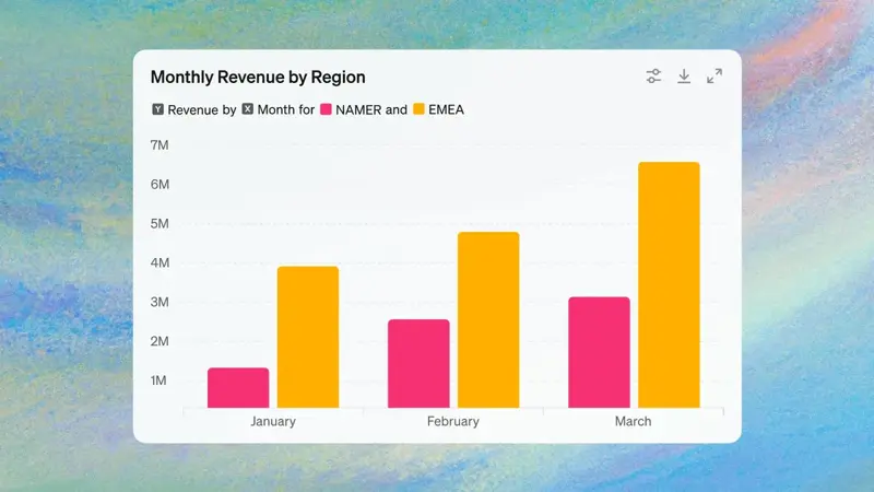
The walkthrough
Step 1 — Get your data in. Upload an Excel (.xlsx) or CSV file, or just paste a small table right into the chat. You can also pull files straight from Google Drive or OneDrive. One tip that makes everything downstream work better: give it a tidy table — a clear header in the top row, one record per row, no merged cells, no blank rows wedged in the middle. Messy in, confused out.
Step 2 — Ask for the chart. Be specific about what you want:
“Make a bar chart of total revenue by month from this data. Sort the months in calendar order, label the axes, and put the dollar amounts on top of each bar.”
Or let it choose, if you’re not sure:
“What’s the clearest single chart to show the trend in this data? Make it, and tell me in one sentence why that chart type.”
Step 3 — Make it interactive and refine. Click “Switch to interactive chart,” then fix anything off with a follow-up — no starting over:
“Use one color for the whole series, make the font bigger, and change the title to ‘Monthly Revenue, 2026.’”
Step 4 — Export. Download the image and drop it into your slide, doc, or email. If you’ll need to rebuild it elsewhere, you can even ask: “Give me the steps to recreate this exact chart in Google Sheets.”
For a typical “I just need one clean chart” job, that’s the whole thing — about five minutes, most of it spent deciding what you actually want to show.
What this means for you
If you’re an office worker: this is the fastest path from “raw export” to “board-ready slide.” Monthly KPIs, a survey summary, a quick comparison for your manager — paste, ask, polish, paste into the deck.
If you’re a student: turning lab data or survey results into figures for a report goes from an evening of fighting Sheets to a few prompts. (Just confirm your course allows AI help, and always check the numbers against your raw data.)
If you run a small business: you don’t need a BI tool to see your business. Export sales or ad results to CSV and ask for a trend line, a category breakdown, or a before/after. Cheap, fast, good enough for most decisions.
If you’re a teacher or nonprofit: grade distributions, attendance, donation trends — a clean chart makes a parent night or a grant report land harder, and you didn’t need a designer.
What this can’t do — and the one rule that matters most
The single most important habit: always sanity-check the numbers it plotted. Here’s the honest risk, straight from people who use it daily — if you don’t already roughly know what the answer should be, the AI can quietly plot the wrong column, mislabel a total, or even guess at a value, and the chart will look perfectly confident while being wrong. A pretty chart of bad data is worse than no chart.
So before you trust it:
- Eyeball the totals. Does the biggest bar match the biggest number in your sheet? Do the percentages add to 100? If a number looks surprising, it might be a mistake, not an insight.
- It can misread messy spreadsheets. Merged cells, multiple tables on one sheet, or a stray header row will throw it off. Clean the data first.
- Defaults can be ugly. The first chart is sometimes plain or oddly colored. That’s a one-line fix, not a reason to give up — just tell it what to change.
- It’s not a live dashboard. This is for one-off charts, not a connected BI tool that refreshes itself. For ongoing reporting, you still want a real dashboard.
- Mind the privacy. Don’t upload spreadsheets with customer names, employee records, or anything confidential to a personal AI account. Strip identifiers, or use sample/aggregate data.
Get those right and the trade is great: minutes instead of an afternoon, for a chart that’s genuinely presentation-ready.
The bottom line
Making a chart used to mean knowing your way around a spreadsheet app. Now it means knowing how to ask — and how to check the answer. Upload your data, describe the chart you want, switch it to interactive, glance at the numbers to make sure they’re right, and export. The skill that pays off isn’t menu-memorization anymore; it’s giving clear instructions and keeping a skeptical eye on the result.
If you want to get fluent at this — from cleaning a messy export to telling a clear story with the chart — our AI for Spreadsheets course is built exactly for the non-analyst who just needs the numbers to make sense. First two lessons are free.